Plating Like a Chef: Minimalist Food Styling for Home Cooks
Minimalist plating is not about making less food look like more food. It's about understanding why negative space, odd numbers, and deliberate sauce placement make a dish more visually compelling - and how to apply those principles without chef training or special equipment.
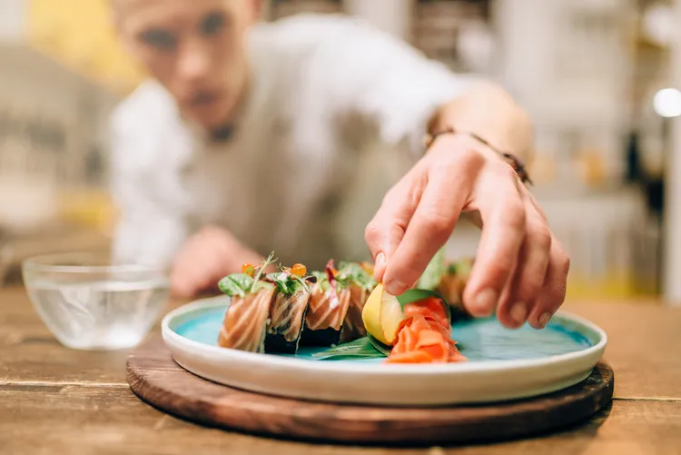
The most common plating mistake is filling the plate. A full plate reads as generous at a family dinner and visually cluttered in a photograph. Restaurants plate to negative space - the empty areas of the plate are as intentional as the food itself, because they direct the eye and create the perception of precision and restraint. That's the fundamental shift in thinking that separates home plating from chef plating.
The Four Principles
1. Negative Space
Leave at least 30-40% of the plate empty. On a 28cm dinner plate, your food should occupy roughly the central 16-18cm. The border is not wasted space - it's a visual frame. The eye moves to a focal point more readily when there's contrast around it. This is why minimalist plating photographs so well: the empty space creates composition rather than chaos.
For oval or rectangular plates (common in quiet luxury aesthetics), the principle is the same but the geometry shifts. Leave more space at the ends; fill the centre third.
2. Odd Numbers
Three scallops, not two or four. Five asparagus spears, not six. Odd numbers create asymmetry, and asymmetry is more visually interesting than symmetry in food styling. This is borrowed from Japanese plating philosophy (kisetsukan - seasonal harmony) and applied in essentially every high-end Western kitchen. Even if you're plating something that doesn't naturally come in countable units, arrange in groups of three: three dots of sauce, three herb leaves, three elements on a composed plate.
3. Height and Texture Variation
Flat plating is the enemy of interesting photography. Even a small amount of height - a sprig of herb placed vertically, a slice of protein leaning against a puree, a sauce drizzled to create a raised trail - creates dimension in a two-dimensional image. Texture variation (smooth puree next to a crisp element next to a soft protein) gives the eye different things to process and makes the plate feel more considered.
4. Sauce Placement
Restaurant plating almost never puts sauce over the protein - it goes under it, beside it, or around it. Sauce poured on top hides the main element and makes the plate look sloppy. For poured sauces: add the sauce to the plate first (either in a pool, a swipe, or a ring), then place the protein on top of or beside it. For finishing oils: drizzle in one motion around the edge of the plate, not back and forth over the centre.
Practical Techniques
The Spoon Swipe
Purees, whipped cheeses, and thick sauces look better swiped than spooned in a mound. Place a large spoonful in the centre-left of the plate, press the back of a spoon into it, and pull firmly to the right in one motion. The result is a curved, tapered stroke - thicker at one end, trailing off at the other. This is the most widely used restaurant plating technique and the one most immediately applicable at home.
Quenelles
A quenelle is a small oval formed by passing a mixture between two wet spoons. Used for ice cream, whipped cream, butter, mousse. The motion: scoop with one spoon, transfer to the second spoon, transfer back, repeat until an oval forms. Takes practice. When done well it transforms a scoop of something into something that looks intentional.
Herb and Microgreen Placement
Single herbs and microgreens go on last, placed rather than scattered. Pick individual leaves and place them - three at most, positioned at the 10 o'clock position on the plate (where the eye enters a composition in left-to-right reading cultures). A small pile of microgreens placed deliberately reads as styled; the same greens scattered randomly reads as garnish. Using fresh herbs properly extends to how they're used as visual elements, not just flavour ones.
Finishing Oils and Dots
Herb oils, chilli oils, and finishing olive oils add colour contrast and visual detail. For dots: use a squeeze bottle or a toothpick dipped into the oil, placed with precision. Three dots in a loose arc. For a drizzle: one confident arc around the protein, not a back-and-forth grid. For a trail: pour from height to create a thinner, more dynamic line.
Equipment That Actually Helps
You don't need much. A squeeze bottle ($2) for sauces and oils. Tweezers or long-handled tongs for precise element placement. A warm plate (run under hot water for 30 seconds, dry) so the food doesn't cool immediately. A damp cloth to clean any sauce smears from the plate rim before serving.
The plate itself matters more than any tool. White, wide-rimmed, with generous surface area - these are the conditions that make quiet luxury plating work. Heavily patterned or coloured plates fight the food. Shallow bowls work well for brothy or sauced dishes.
The Phone Test
Before serving, hold your phone over the plate at the angle you'd photograph it (usually 45 degrees or directly overhead). If the composition looks wrong in the viewfinder, adjust before the food gets cold. The overhead shot (flatlay) works for composed plates with multiple elements on a flat surface. The 45-degree shot is better for dishes with height or depth. Both are valid quiet luxury formats - what matters is that you've chosen deliberately.
The full context for why restraint and precision matter in quiet luxury cooking - from technique to pantry to plating - is in the complete quiet luxury cooking guide.
Colour Theory in Food Plating
Colour contrast makes food more visually appealing for the same reason it makes any design more visually appealing: differentiation gives the eye something to process. The least interesting plates are monochromatic - everything beige, everything green, everything brown. The most striking quiet luxury plates tend to work with one dominant colour (the protein or main element), one accent colour (a herb oil, a sauce, a vegetable), and white or cream as the base (the plate itself, or a white puree).
Avoid more than three distinct colours on a plate unless you have a strong visual reason. Each colour added creates another relationship to manage. The muted, tonal quality of quiet luxury food photography - the kind that performs well on Pinterest and in food media - comes partly from restraint in colour palette. Earthy tones, muted greens, ivory, gold. Not bright red and bright green and bright yellow in the same composition.
Temperature and Timing: The Overlooked Variables
All the plating technique in the world doesn't help if the food is cold. Warm plates for hot food - this is non-negotiable in restaurant kitchens and ignored almost universally at home. Run your plates under very hot water for 30 seconds, or put them in an oven at 80°C for 5 minutes before plating. Warm plates extend the eating window by several minutes, which matters both for the experience and for photography (you have more time before the food loses its just-plated appearance).
The second timing variable: plate one portion at a time, even for dinner parties. Trying to plate four portions simultaneously while food cools is the most common reason home entertaining food arrives lukewarm. Plate one, check the composition, make adjustments, then plate the others. It takes 30-60 seconds more per plate and produces dramatically better results.
Photographing Quiet Luxury Food
The plate is step one. The light is step two. Natural side light (from a window, not overhead) is the most flattering for food photography - it creates shadow and dimension that overhead window light or artificial light doesn't. Place the plate near but not in front of a window, with the light coming from the side at roughly 45 degrees. Late morning and early afternoon provide the most neutral, consistent light.
Backgrounds matter as much as the plate. Quiet luxury food photography favours: linen napkins (soft texture, neutral colour), slate or stone surfaces (matte, natural), worn wood (warm but not rustic), and white marble (clean, aspirational). Avoid: printed tablecloths, plastic surfaces, anything that competes with the food in pattern or brightness.
Post-processing: slight warmth, lifted shadows, slightly reduced highlights. The aesthetic in quiet luxury food content is consistent - clean, slightly warm, never oversaturated. This is achievable with any smartphone editing app (Lightroom Mobile has free presets that approximate it) and takes less than 60 seconds per image.
Practical Plating for Weeknights vs Entertaining
There's a version of minimalist plating that takes five minutes and one that takes thirty seconds. For weeknights: choose a bowl or wide plate, place the main element deliberately (not dumped), add one finishing element (herb, oil, flaky salt), use a clean plate rim. Three steps, under a minute. The result is noticeably better than food served without thought, and the habit becomes automatic.
For entertaining: pre-warm plates, plan the composition before cooking starts, use the spoon swipe and quenelle techniques where appropriate, photograph one plate before serving. The extra effort for guests is less about the technique and more about the intention - the quiet luxury aesthetic is, at its core, about cooking and serving with care rather than casualness. The full approach - from the recipes to the techniques to the plating philosophy - is what the quiet luxury cooking guide is built around.
The White Plate Question
White plates are the default for quiet luxury plating because they provide maximum contrast with food colours and the most neutral possible background. But not all white plates are equal. Wide-rimmed white plates (the bistro plate style) create the most pronounced negative space effect. Shallow white bowls work for sauced dishes and brothy preparations. Flat, rimless white plates are harder to use well because there's no defined edge to frame the composition - the eye doesn't know where the plate ends.
Alternatives that work within the aesthetic: matte black (high contrast, dramatic, works for strongly coloured food), dark slate grey (similar to black but slightly warmer), pale stone or concrete-effect ceramics (currently very prevalent in food media for this reason). Avoid: high-gloss patterned china, busy prints, anything that competes with the food's colour or texture for visual attention.
Bowl shape for brothy dishes matters more than it seems. A shallow bowl with a wide rim keeps the broth warmer longer (less surface area exposed) and creates a frame around the composed elements. A deep bowl concentrates the elements and makes plating harder. The soba noodle dish in the quiet luxury cooking guide is an example: a wide, shallow bowl allows the broth, noodles, egg, and garnish to be composed rather than simply piled.
Common Plating Mistakes and How to Fix Them
Everything is the same height: Flat plating produces flat photographs. Add one element with height - a sprig of herb placed vertically, a sauce trail that builds from thin to thick, the soft egg sliced and leaned rather than laid flat. A single vertical element is enough to add dimension.
The sauce is wrong: Sauce poured over protein (rather than under or beside it) covers the main element and makes the plate look messy. If you've already plated incorrectly, add an additional sauce element in a different position to redirect attention - a dot pattern around the edge, a drizzle of herb oil - rather than trying to correct the original placement.
Too many garnishes: Each additional garnish element adds visual noise. If you have three garnishes - an herb, a sauce dot, and a sprinkle of something - consider removing the one that contributes least to the flavour or colour composition. Two garnishes that are intentional read better than three that are reflexive.
Smudged plate rims: A clean rim is a marker of care that registers even subliminally. Wipe plate rims with a clean damp cloth before serving. The thirty-second habit transforms the visual cleanliness of every plate.
Plating for Different Occasions
The level of plating precision appropriate for an occasion varies, and misjudging this creates its own kind of awkwardness. A dinner party for six adults who appreciate food warrants careful plating - warm plates, spoon swipe, deliberate garnish. A casual dinner for family or close friends warrants something in between - a clean plate, one finishing element, no performance. Sunday lunch warrants serving from a beautiful dish at the table rather than individual plating - the quiet luxury aesthetic applies equally to a well-chosen serving bowl and the restraint of not over-garnishing it.
The most important thing is internal consistency: the level of care in the plating should match the level of care in the cooking. A precisely plated dish that's been carelessly cooked creates cognitive dissonance. A simply presented dish that's been meticulously cooked communicates the right hierarchy - that the flavour is the point, and the presentation supports it without trying to compensate for it.
Developing an eye for plating comes from looking deliberately: at food media that represents the aesthetic you're aiming for, at your own plates photographed after cooking, and at the gap between the two. The gap narrows with practice - plating instinct becomes as automatic as seasoning instinct, and eventually both happen without conscious effort. That automaticity is the goal: technique that's been internalised enough that it doesn't require thought, freeing you to focus on the cooking itself. For the full approach, the quiet luxury cooking guide covers everything from technique to the recipes that demonstrate it.
Latest