Color Theory for Food Photography
Colour is doing more work in your food photos than you realise. Understanding basic colour relationships helps you choose plates, backgrounds, and props that make food pop instead of disappear.
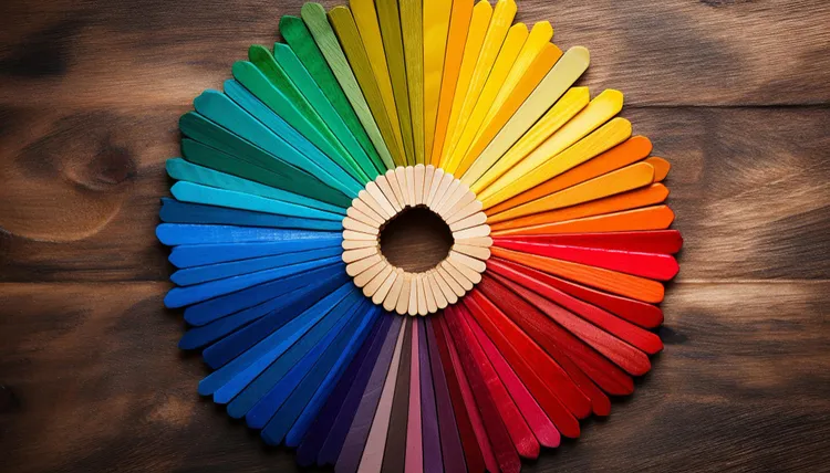
You don't need a design degree to use colour theory in food photography. You need two concepts: complementary colours (which create contrast and energy) and analogous colours (which create harmony and calm). Once you know which effect you're going for, plate and background choices become obvious.
The Colour Wheel Basics
Complementary colours sit opposite each other on the colour wheel: red and green, orange and blue, yellow and purple. Placed together, they create visual contrast - each colour makes the other look more intense. Analogous colours sit next to each other: orange, red-orange, red. Together, they create a harmonious, cohesive feel.
Both approaches work in food photography, for different purposes. Complementary for bold, attention-grabbing images. Analogous for calm, cohesive, editorial aesthetics.
Complementary Colour Pairings That Work in Food Photography
- Green food + red/terracotta background: Green salads, guacamole, and herb-heavy dishes on terracotta or rust-coloured backgrounds. The contrast makes the green look more vivid. A simple cabbage salad on a terracotta plate becomes visually striking with this pairing.
- Orange/yellow food + blue/grey background: Curries, roasted vegetables, eggs, and pasta on dark slate or blue-grey tile. The warm food tones glow against the cool background.
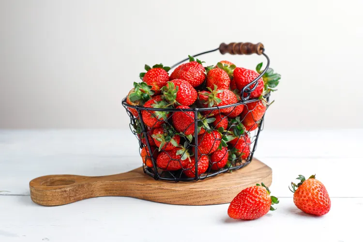
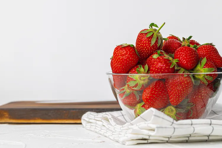
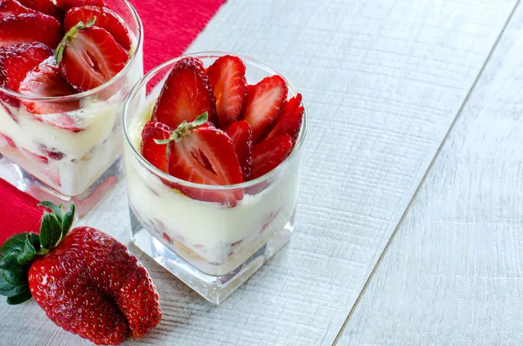
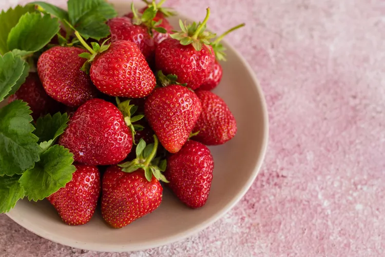
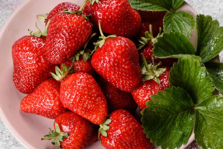
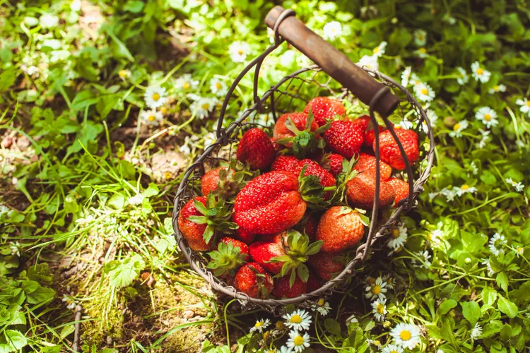
- Red/pink food + green props: Tomato-based dishes, salmon, and strawberries with fresh herb garnishes or a sage green linen. The red-green contrast is one of the strongest in food photography.
Analogous Pairings That Create Warmth
- Brown + beige + cream: Roasted chicken, bread, oats, nuts. All in the same warm-brown family. The result is cosy and editorial. Works well for autumn and winter dishes.
- Green + sage + olive: Salads, green smoothies, herby dishes on sage green or olive backgrounds with natural wood. Calming, fresh, health-forward aesthetic.
- White + cream + light grey: Clean, minimal, and universally adaptable. Ideal for dishes where you want the food colour to speak without any competition.
Plate Colour and Food Colour
The plate should complement the food, not match it. Red sauce pasta on a red plate disappears. The same pasta on a white, cream, or dark slate plate becomes the clear subject. General rules:
- Warm-toned food (yellows, oranges, browns): neutral or cool plates (white, grey, slate, blue)
- Cool-toned food (greens, purples, blues): warm plates (cream, terracotta, wood)
- Very colourful food (mixed grain bowls, salads): white plates eliminate competition entirely
The Role of Neutrals
Neutrals (white, grey, black, wood tones, cream) are the foundation of most food photography colour palettes. They don't compete with food and they work as buffers between colour elements. Most professional food photographers have a palette of 80% neutrals and 20% colour accents.
When you introduce a colour prop or background, it should be one deliberate choice — a terracotta napkin, a blue-grey tile, a sage green bowl. One colour accent surrounded by neutrals is controlled and intentional. Three or four colour accents in the same frame becomes noise.
Colour Temperature and White Balance
Colour temperature affects the entire mood of a photo. Warm-toned photos (slightly yellow-orange) feel cosy and inviting - good for comfort food, baking, autumn dishes. Cool-toned photos (slightly blue-grey) feel fresh and modern - good for salads, seafood, and health-focused content. You can shift colour temperature in editing, but it's easier to get it right at the shooting stage by setting white balance manually. Our guide to smartphone camera settings covers this in detail.
Colour is one of the fastest levers available in food photography. Adjust your plate and background choices with these principles and you'll notice the difference immediately. For the full picture on building a consistent visual approach, the food photography guide for home cooks is the complete reference.
Latest